This week in workshops we are looking at developing an existing digital platform product; mine within the subcategory of ‘commuting’. So, I am going to find a bad example of an app or website relevant to this and redesign it.
After researching bus and train apps on the Play Store, many of which (National Rail/First ‘train times’) look quite slick and easy to manoeuvre around, I found ‘My Bus Edinburgh’ which features a clip art bus logo and a very basic interface that although can be used, you’d rather not have to.
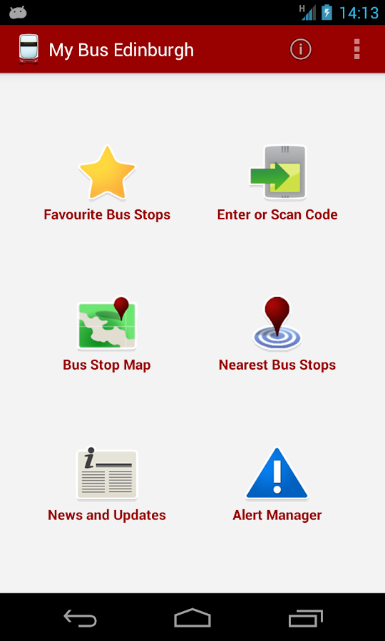
The home page of ‘My Bus Edinburgh’
For an app that offers the relatively new feature of scanning a QR code off a bus stop, the interface isn’t compatible with this modern technology. The icons do their job but they look outdated and it doesn’t look interactive at all – which although might not matter, this doesn’t present the app as an accurate information source that is up to date and quick to use.
Clicking on the links through to other pages, there is no explanation of how to use the application which is not useful if you are in a rush to catch a bus, and the actual map showing where each bus stop is located, is over crowded and difficult to navigate. It’s not designed to make it self explanatory and there is no help for the users if they are struggling.
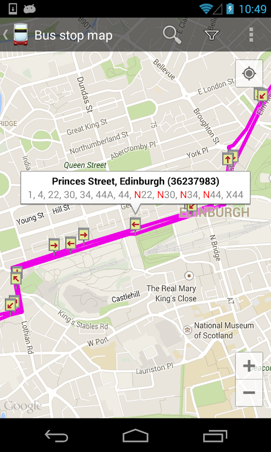
The map feature which is currently only showing one route.
After clicking on the cup like icon (which I realise now is probably meant to be a funnel) in the top right of the page, I finally found how to search for bus stops/routes via the bus number which makes the whole process a little easier.
The Play Store page for this app shows many different options that honestly I can’t work out how to access via the app e.g. ‘live departures’. Also, a feature I would expect, yet it doesn’t have, is a timetable for buses in the future.